»We try to use […] the motivational character of music to unleash […] movement.«
– Daniel Scholz (Dipl. Psychologist) does research in the area of movement sonification
We took this one step further and designed an app which helps to restore fine-motor skillsafter suffering from a stroke. Klangmotor enables the patient to continue or extend doing his exercises beyond the therapy session. The application employs music and a joyful design in order to motivate its users to improve their skills.
The initial problem
Research has shown that music supported therapy can be used as an effective addition along established forms of therapy in neurological rehabilitation. Even though this form of therapy is more efficient and more motivating for the patients, it is used less often as an additional therapy for fine motor skills. This led us to the following questions:
»How can design be used in order to make music supported therapy more attractive to both therapists and patients? How can this method be established as an additional treatment in neurological rehabilitation of stroke patients?«
Design Challenges
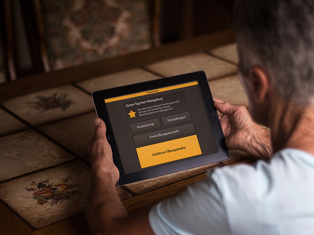
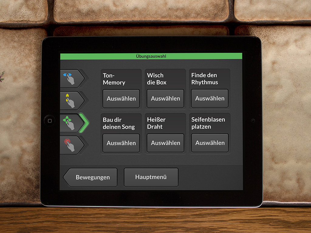
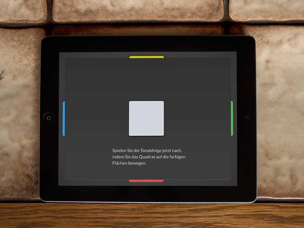
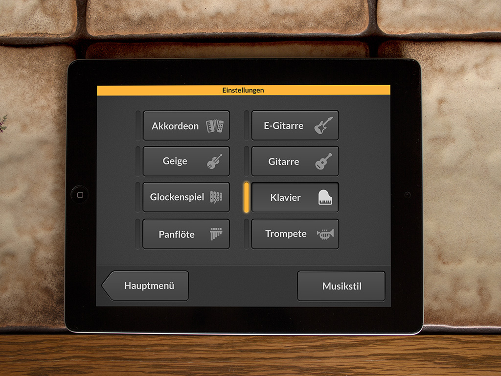
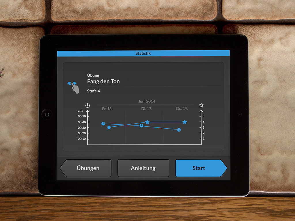
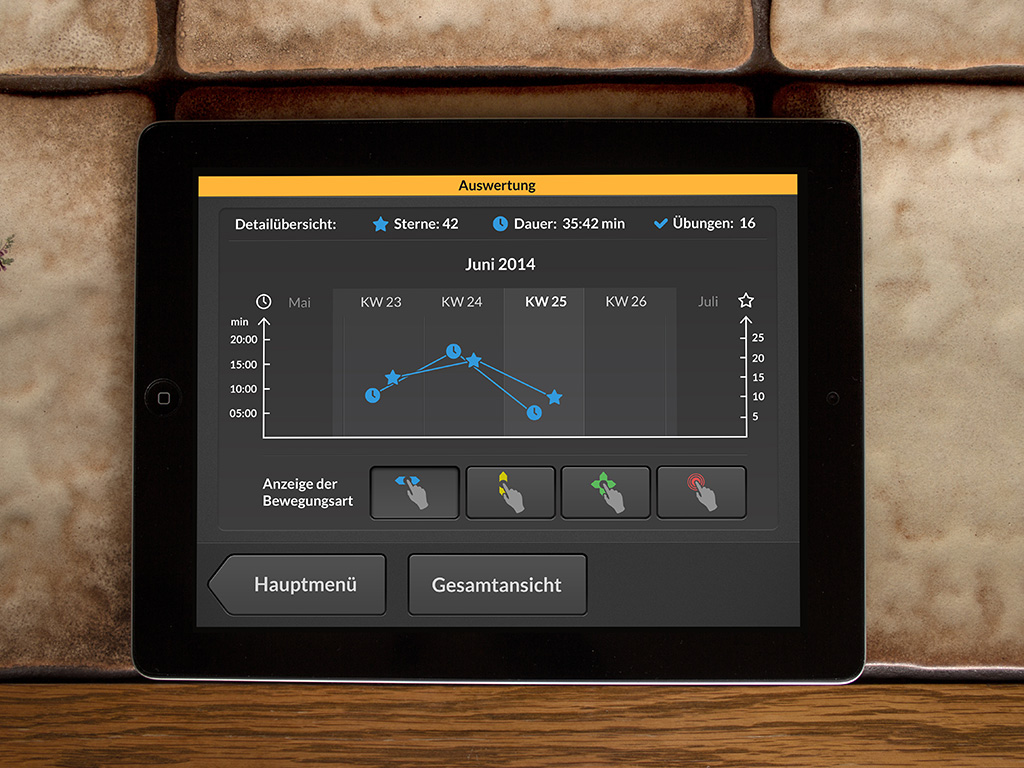
There where different parameters to be considered due to the user group mostly consisting of disabled seniors. This restrictions were the main force for the decisions concerning the application’s design. Because of the high age and the disabilities of most stroke patients there was a need for really large and skeuomorph designed buttons. They were designed in a way that resulted from the insights we gained through undertaking different interviews. A good contrast and readability was ensured by the choice of dark colors for the interface. Consequently colorful accents have been used to effectively highlight and gain attention. The different categories of movement exercises were color coded. By picking one category, the color got attached to all other colorful elements of the interface in order to provide an easily learnable indicator of the kind of movement to be performed next. As stated before, the design of the buttons and elements was done in a skeuomorph way. Skeuomorphism in user interfaces is highly orientated along metaphors of the real world. The navigation area was placed at the bottom of the application and constantly follows the same principle. It consists of a maximum of three buttons due to the big measurement requirement for stroke patients. The button on the left takes the patient one step back while the button on the right handside leads to the next step. The third button is placed at the center and provides additional contextual information. We tried to stick to this principle of navigation as much as possible during the interaction process. Thus, we ensured a smooth experience with little or no distraction caused by jumping navigation elements and alterning navigation structures.
Advantages of Klangmotor
- Supports both occupational therapists and physiotherapists directly in the process
- Uses music as a motivational factor
- Enables the patient to improve their skills both at home and in therapy sessions
- The app uses auditory feedback, which, according to research findings in the field of music-supported training, supports a faster recovery
- Therapists get evaluations and get detailed insights in their patients’ progress by the use of session recordings
- Patients get motivated through evaluations and rewards (achievements)
- Patients get motivated through evaluations and rewards (achievements)
- A tablet is a familiar device with less barriers to get started as compared to an instrument
